Form matters

Visual communication can promote knowledge acquisition and help us to become better thinkers. But for that to become a reality, we first need to develop a better understanding of the potential visual communication offers.
A tweet, a Facebook update, an ad, a logo, a news item. Streams of textual and visual messages, emanating from a series of media outlets, are an ever-present feature of our lives. These messages seek to influence us. Indeed, it’s been estimated that the average person is exposed to up to 5,000 messages daily, each of them vying for attention and seeking to influence.
Amidst all that noise, it’s entirely understandable that people’s focus tends to be on the content of the messages they see at the expense of their form.
Typography is one feature that tends to pass casual readers by. And it does make sense; who would focus on font when there’s so much interesting content to get into? It’s similarly easy to overlook the formulaic practices that characterise much of visual communication. Many of us are instinctively familiar with certain types of images, charts and layouts. It’s hard to be aware of just how strongly they shape our responses to what we are seeing. Although instant recognition factor is a useful feature when it comes to certain types of text, including official forms, which should ideally be self-explanatory and leave nothing open to individual interpretation, other content, including news content generated by social media newsfeeds, which are responsible for pushing ever greater numbers of people towards echo chambers shared with like-minded individuals, can, less helpfully, employ similar strategies.
We quickly develop a blindness to certain types of visual communication. And yet, conversely, audiences are conditioned to notice anything new and different. Advertising relies on the wow effect, much like experimental contemporary art which seeks to shock us to attention.
“Form and content have always been inextricably linked,” Professor Arja Karhumaa points out. As a graphic designer, she’s calling for a broader public awareness of what communication really is. "Thinking, writing, reading and visual design all feed off each other and impact powerfully on their audience. The visual aspects of communication alone generate significant amounts of information, around and amidst the textual content.”
As almost all information is about to go digital, it’s important that we develop a new and clear understanding of just how multi-dimensional communication really is. “When it comes to communication, we’re all pretty Gutenbergian,” Arja Karhumaa says. “Gutenberg developed the European printing method in the 15th century. It’s based on loose letters arranged in neat rows. Six centuries later, the western typographical style remains virtually identical: texts are linear, lettering is square and information is neatly laid out in a grid formation. It looks like we’re about to carry these paper printing techniques straight over to the digital realm without pausing to consider what the alternatives might be. And if there’s one thing the digital realm provides, it’s alternatives.”
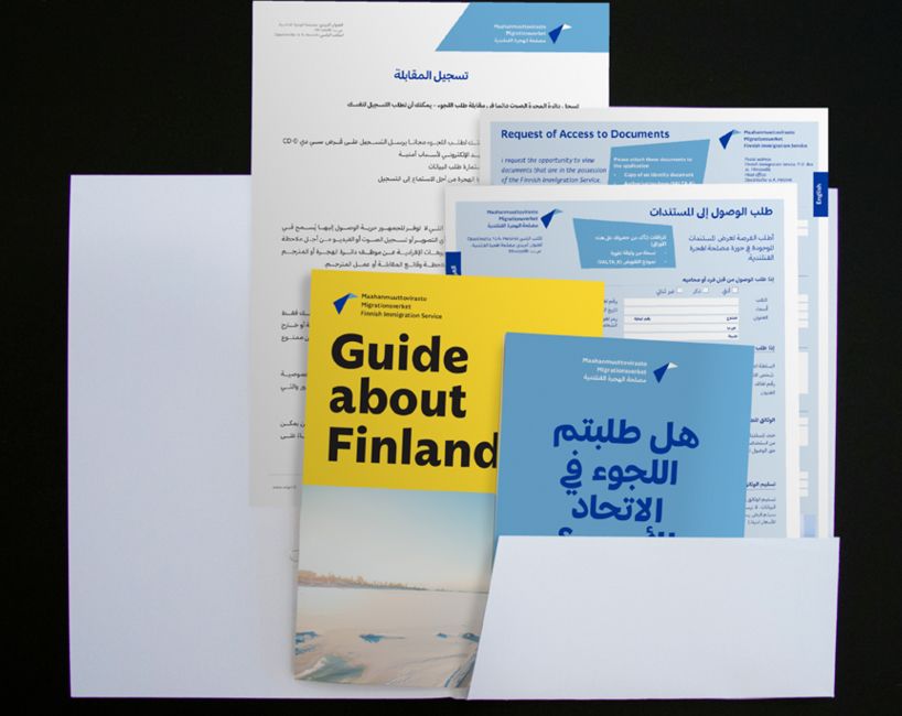
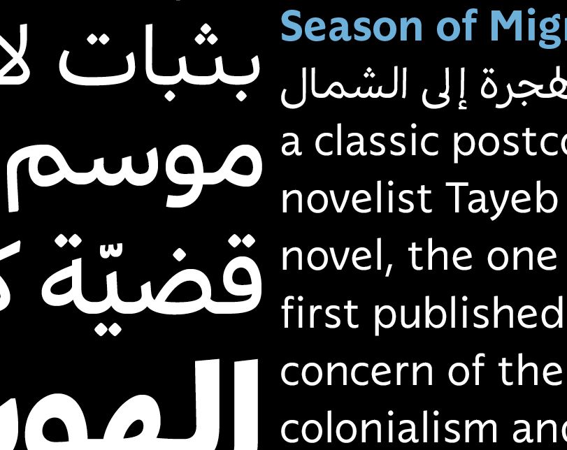
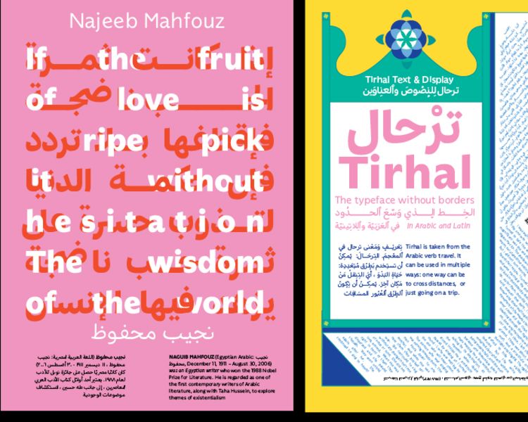
Due to global migration, the use of multiple languages has become a practical necessity in materials produced by the public sector. Aalto VCD student Samar Zureik wanted to help the Finnish Immigration Service to produce better documents. The ’Tirhal family’ explores how to create a harmonized typeface in two scripts — Arabic and Latin — to be used in the public sector, and still maintain visual consistencies. The goal is to achieve good legibility, a unified visual identity and better overall communications. Images: Samar Zureik
Due to global migration, the use of multiple languages has become a practical necessity in materials produced by the public sector. Aalto VCD student Samar Zureik wanted to help the Finnish Immigration Service to produce better documents. The ’Tirhal family’ explores how to create a harmonized typeface in two scripts — Arabic and Latin — to be used in the public sector, and still maintain visual consistencies. The goal is to achieve good legibility, a unified visual identity and better overall communications. Images: Samar Zureik
Information is never neutral
Arja Karhumaa is at pains to emphasise that information is never neutral – it’s always produced by someone or something, whether that’s people, technologies or processes. All of them bring their influence to bear on the reader, the recipient of that information.
“We all know that the internet is a fast-paced environment, and the speed that’s built into it is having an impact on all of us. Our capacity for concentration is becoming impaired, along with our critical thinking ability. So, what can we do to promote deeper knowledge acquisition and thinking? Visual communications professionals are all about form. I believe that my colleagues and I have a lot to contribute and new solutions to offer here.”
High-quality, carefully-designed communications can deliver extremely positive outcomes. And visual communication has a lot to offer when it comes to accessibility, for example.
“Far too often, content that is branded ‘accessible’ and ‘clear’ is just a stripped-down version of the standard text with no distinctive aesthetics or design features. But is minimalism the best way to achieve genuine accessibility? I’m inclined to say no, especially if we accept that the form in itself is a form of information sharing. On one of my accessible typography courses, I asked the students to turn their attention to the accessible materials provided by Kela, the Finnish social insurance institution on the various benefits available here. It was a joint venture with Kela and Selkokeskus, the Finnish Centre for Easy Language. We ran a series of experiments on what accessibility at its best and most genuine could look like, how workable the current rules around accessibility are and tried to identify the point at which materials become completely unreadable.”
We also need effective strategies to deal with misinformation and disinformation, one of the greatest challenges of our time. Could visual communications be of help there?
“All textual forms have their own distinct history. Charts, for example, which rely on mathematical principles, came about in their own particular way and their form and their instant recognition-factor are due to their mathematical origins. You can display anything as a chart, and it will look scientific – even if the data in it are completely made up. It’s this sort of hinterland that we need to highlight for people.”
Ultimately, we all need better media literacy skills. Fact checking is now routine for large media outlets, but we’d do well to expand our definition of media literacy to encompass the visual dimension: typographies, images, diagrams and so on. And we need to be equipped to critically evaluate all the information placed in the public realm. Who is publishing what? On which platform? And on whose say so?
Karhumaa points out that visual design professionals would benefit from exploring the entire textual and communications ecosystem and it should be covered as part of their training. How do form, content and our individual world view influence how we understand the messages that we actively seek out and are passively exposed to? This is an important consideration, because the form of what we see in front of us subconsciously informs our perception of it, even before we’ve got around to reading the content itself.
If you were under the impression that the texts that you read and the media content you consume are for instant consumption, think again! It’s always a good idea to take a peek behind the scenes first and see how it all really works.
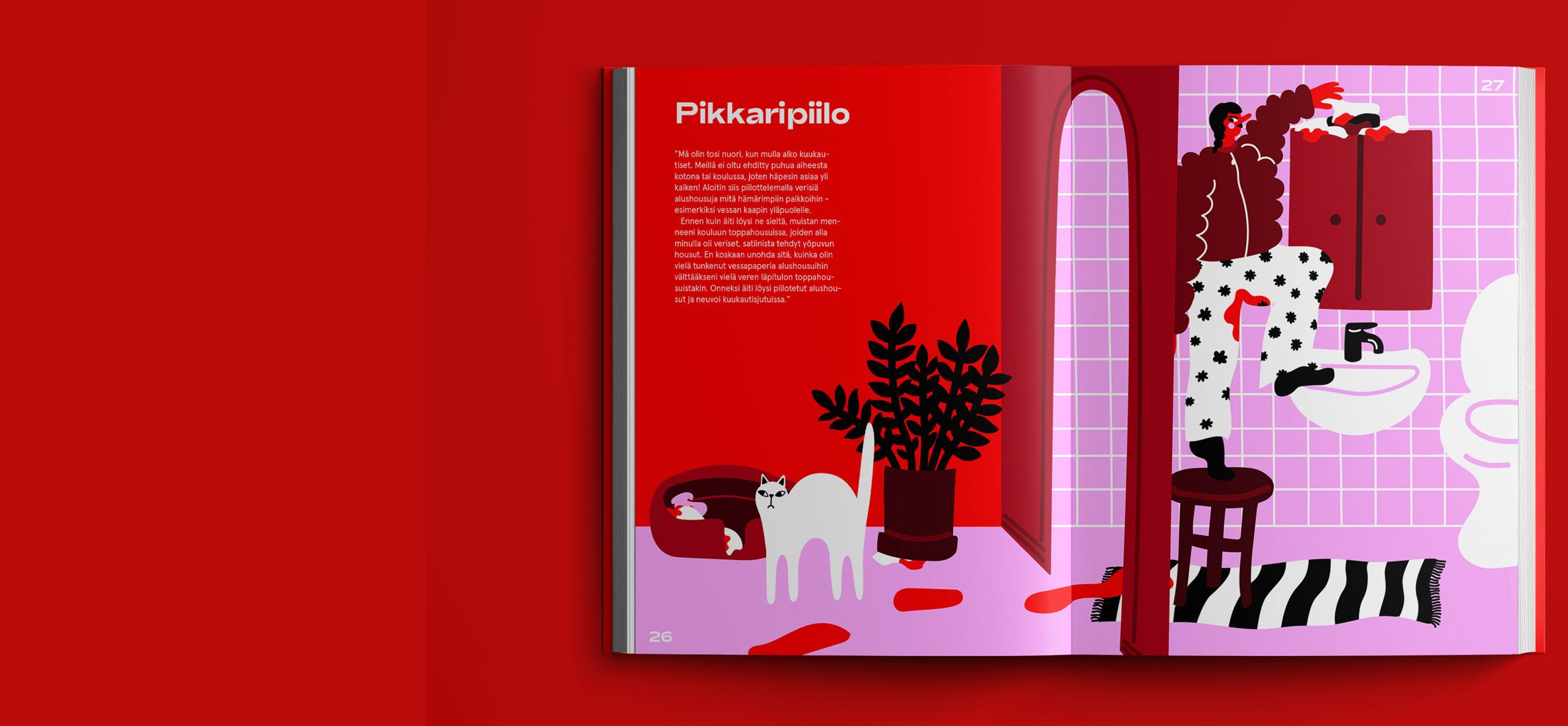
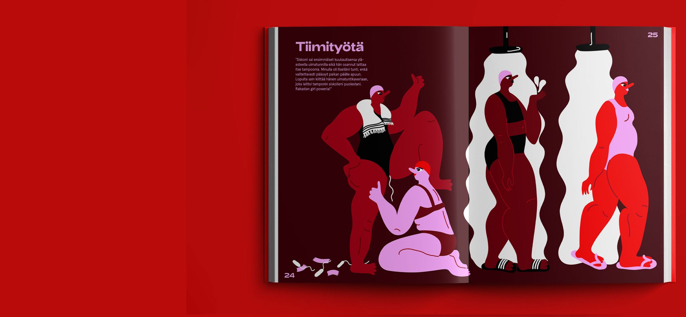
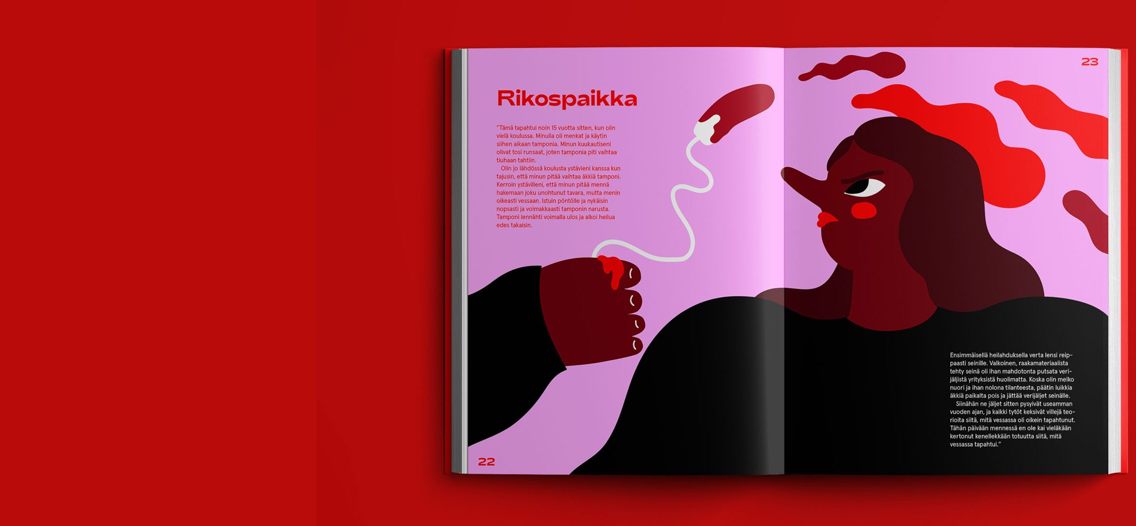
Images by Sanni Wessman:
Red – Stories About Periods
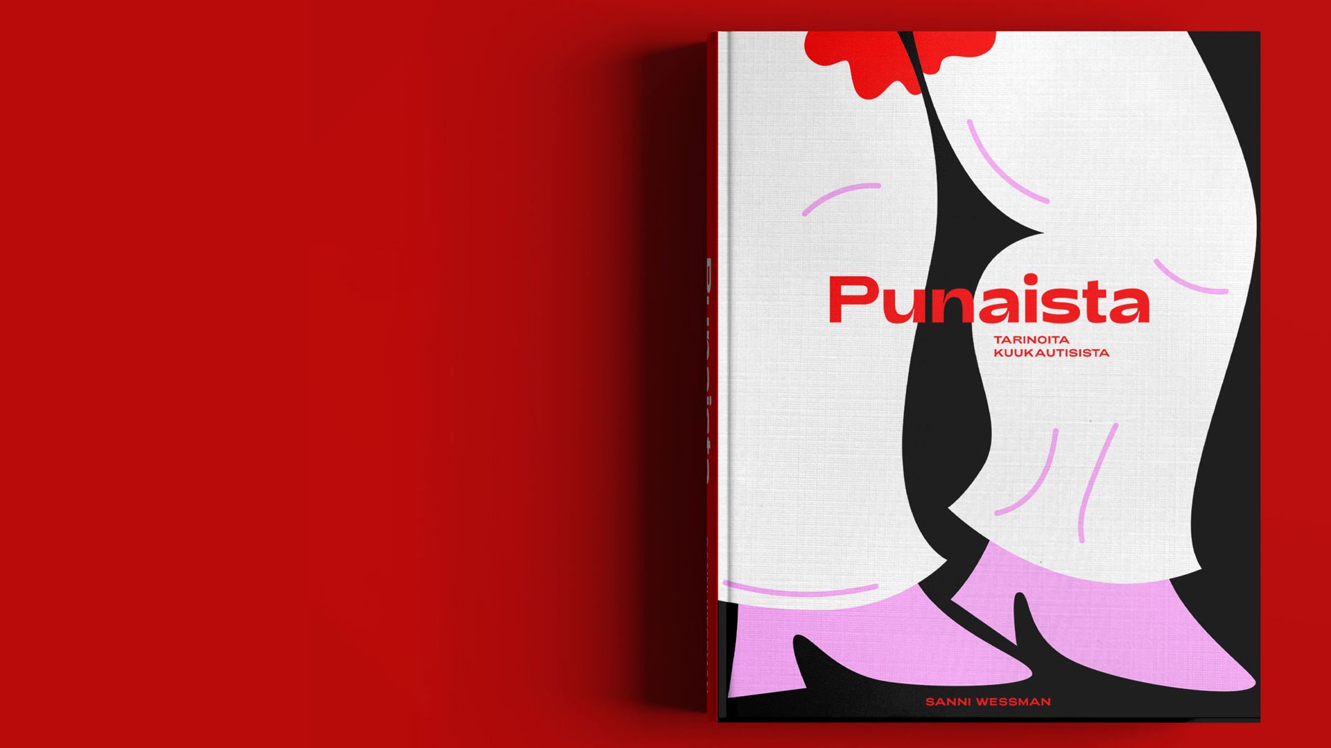
Red (in Finnish Punaista – Tarinoita kuukautisista) is a concept of an illustrated book where menstruation gets to take the centre stage. Red consists of twelve real life stories about periods which are illustrated in a bold and playful way with a blood-red colour palette. The book’s main aim is to decrease period shame and de-stigmatise the topic.
Wall of Silence is a data visualisation that studies an ugly subject: the network of people that enable sexual abuse. Swiss designer and Aalto alumna Adina Renner worked on this project at Aalto University in 2018.
The project’s starting point was the widely publicised case of paedophile physician Larry Nassar who, as team doctor of the USA Gymnastics national team, sexually abused at least 265 young women and girls over a period of more than 20 years. Following his trial in 2017–2018 Nassar was sentenced to a minimum of 100 years of imprisonment.
Adina Renner was struck by the way in which the news coverage systematically avoided discussing the reasons why such a large number of gymnasts suffered abuse for such a long period of time without the abuser being caught. The core question was: Why did the people around him remain silent for so long?
Adina collected data from hundreds of news articles, then analysed and organized it. The visualisation of the data revealed repeated patterns of behaviour that would not have been so obvious otherwise. A classic network diagram showed the institutions in which Nassar had worked during his career as well as the people linked with the operations of these institutions. The silent enablers of abuse formed ‘walls of silence’, and breaking through them was almost impossible for the victims.
Wall of Silence was shortlisted for the Kantar Information is Beautiful Awards (alongside major newspapers the Guardian and the Washington Post) in 2018.
Arja Karhumaa
Arja Karhumaa is a graphic designer and text artist, and Assistant Professor in Visual Communication Design. Arja’s work spans across typography, design, and experimental writing in both poetry and academia. She strives to maintain a rigorous art and design practice alongside teaching and administration, and her work has been published and exhibited in anthologies, galleries and festivals within Europe.
The Visual Communication Design programme (VCD) at Aalto University is an international learning community committed to investigating new modes of action within visual communication. Go to the VCD archive for more inspiring examples of visual communications.
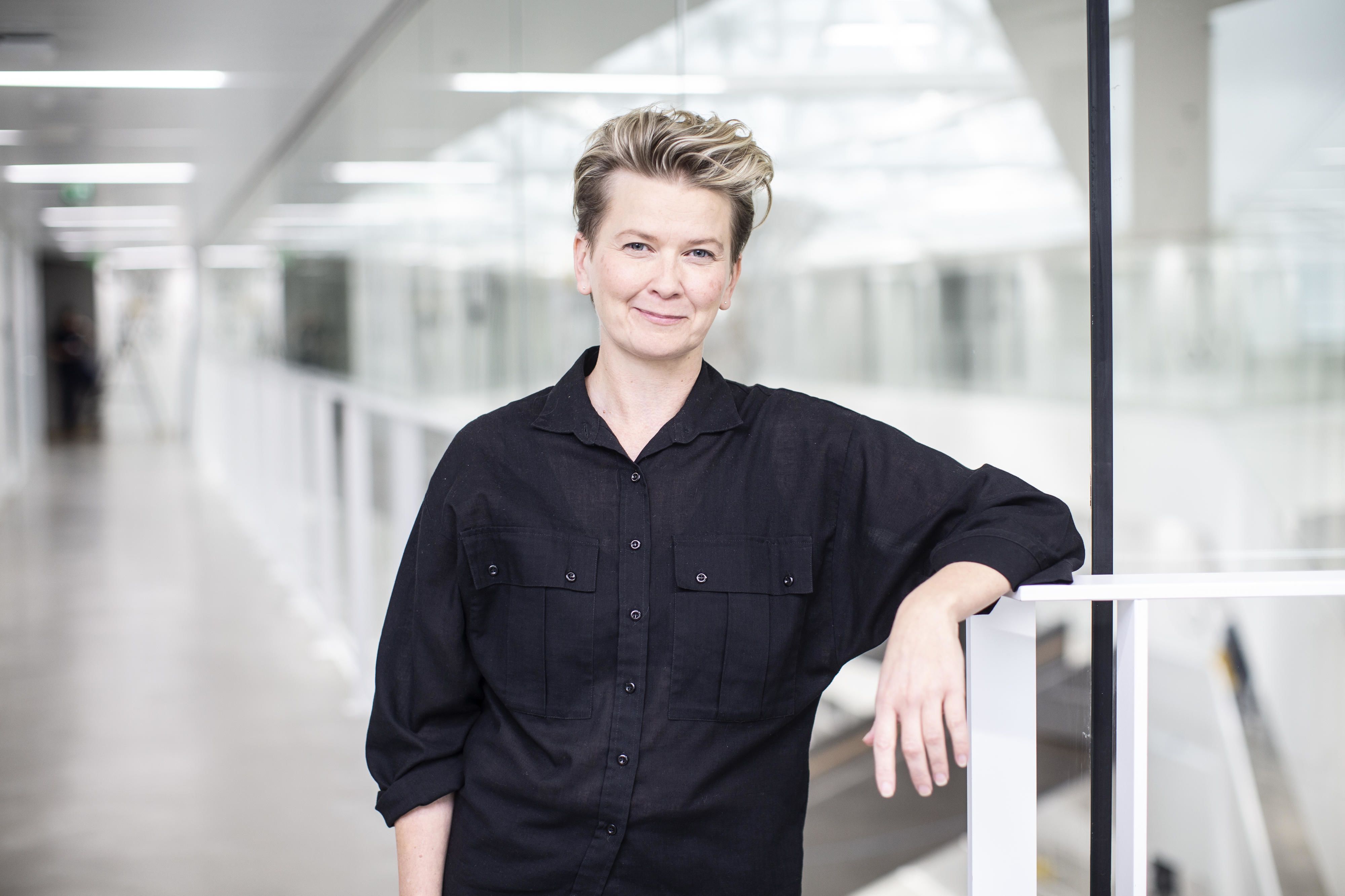
Photo: Evelin Kask
Photo: Evelin Kask

