Data visualisation helps us understand the world
Information design plays an important role not only in our daily lives, but also in presenting scientific results.

Though we might not notice, data visualisation helps us in our everyday lives. When information is presented in a visual form, we understand and remember it more easily. Visualisation also plays an important role in presenting scientific results, which is accurately represented by the FinnGen project on the genetic make-up of Finns.
The amount of information in the world is huge and growing at an exponential rate. The avalanche of visual stimuli is also at its maximum. In the midst of it all, how can we discern what is important?
To help us structure the world, often without our realising it, we use information visualisation, or information design. Its aim is to present information as clearly as possible in a visual form.
Everyday, in the widespread media landscape and on social media channels, we see infographics and other visual representations of information produced in an easily understandable form.
It's not about gimmickry with visual elements, but about the simplest possible way of presenting something so that it can be properly understood. The golden rule of information design is to choose the presentation that produces the clearest possible result.
Data visualisation is particularly important in science: complex issues are easier and faster to grasp when information is presented in a visual way.
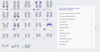
A team of students from the Department of Art and Media at Aalto University is participating in the FinnGen research project on Finnish genetic information, led by the University of Helsinki.
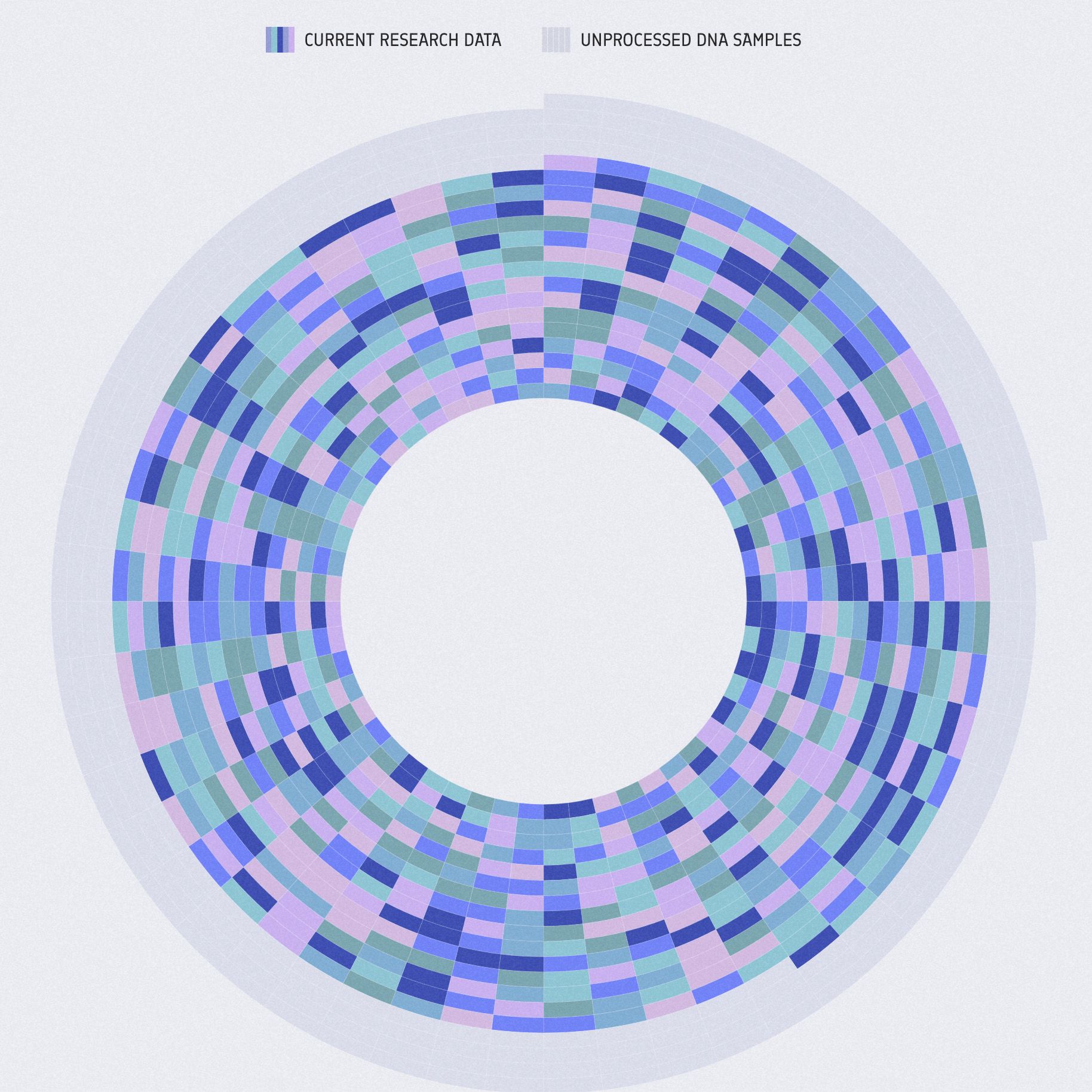
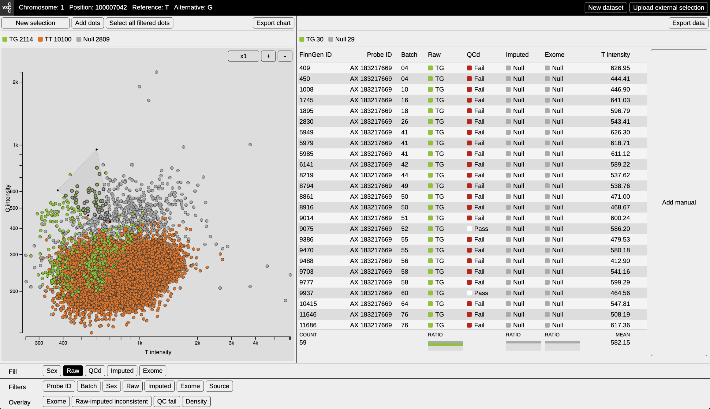
‘Data visualisation is part of the process of making a secure environment user-friendly. Visualisation is one of the factors that enable the data to be widely used. Aalto's visualisation team has been central to this process, as we genetic researchers would not have had such expertise’, says Aarno Palotie, Scientific Director of FinnGen.
With their expertise in information design and interactive data visualisation, the students and teachers at the university have worked with the genetic researchers to produce a visual representation of the research.
‘The various tools developed in collaboration with the Aalto team for visualising the results highlight the characteristics of the FinnGen data and help researchers to notice connections between variables or results that might otherwise go unnoticed’, continues FinnGen's Project Manager Mervi Aavikko.
Information design helps us to separate the essential from the misleading, and to make sense of the world around us.


Our visual world
Why does information visualisation matter? After all, don't we have at least a reasonable understanding of the text we read?
Vision is arguably our strongest sense and the most important of the senses for perceiving our environment: almost 90% of all sensations enter our brain through the eye. We are able to visually perceive our environment, and the changes within it considerably more quickly and precisely than with our other senses.
A picture is worth a thousand words. When information is presented visually, it is easier to understand and to get an overview of things. Typically, we adopt new information most readily when presented in visual form and remember it more permanently than text alone. We may even miss information if we don't see it in visual form.
Humankind has been creating visual documents of its surroundings for tens of thousands of years—the oldest known evidence dates back 40,000 years. For instance, although the purpose of wall and rock paintings remains unknown, they are seen as evidence of man's need to record information and represent it visually.
While technological advances continue to provide us with new and ever better tools and methods, the fundamental laws have not changed: our eyes and brains still work in the same way as those of our ancient relatives.
The process of choosing how to present information and composing the presentation, taking into account the capabilities and limitations of the sense of sight, is called information design.


The importance of correct information
As more and more data becomes available we are faced with more false information. Moreover, data is also actively used as a tool for opinion-forming and lobbying.
Misinformation is the deliberate or unintentional dissemination of false or inaccurate information and disinformation is intentionally misleading or false information disseminate, in order to influence the recipient's actions or opinions.
Therefore, an important rule for all of us is that we must be critical of our data sources.


Although images and text are mutually reinforcing and not substitutes for each other, images have enormous power. Well-crafted graphics can add to our knowledge and understanding of the world and, at their best, they can also help to change it. Graphics are also a more powerful tool than text in misleading people.
Fortunately, deliberate misrepresentation of information is relatively rare, but we witness it too often these days. For example, intentionally and unintentionally made graphics that contain incorrect information or give the wrong impression are still spread across the widespread media and social media channels.
The accessibility of correct information is also important from a democratic and inclusive perspective: it is important that everyone has equal access to right data and data-based information.
For researchers and journalists, the accuracy of data presentation is particularly important – and this is where information designers can help. Indeed, a key ethical guideline for information designers is that visualisations should only present true claims about the real world, in the clearest possible way.
It is their duty to take great care that the information is correct and that it comes from a reliable source. The way in which the information is presented must be chosen so as not to mislead the reader and distract from the real features of the material, and the presentation must give a true picture of the interrelationship of the facts.
Ethical issues are a concern to all designers of visual communication.

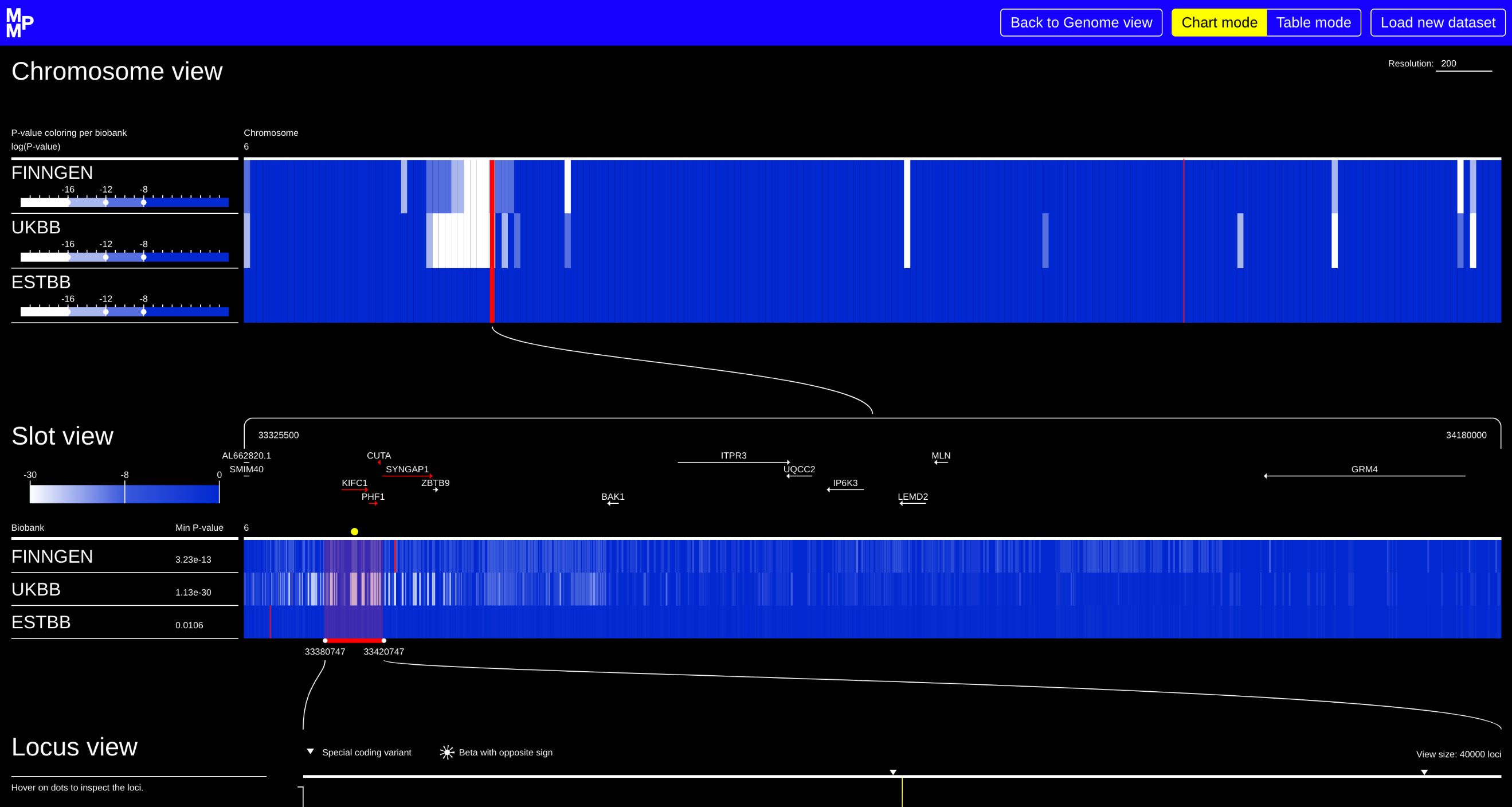

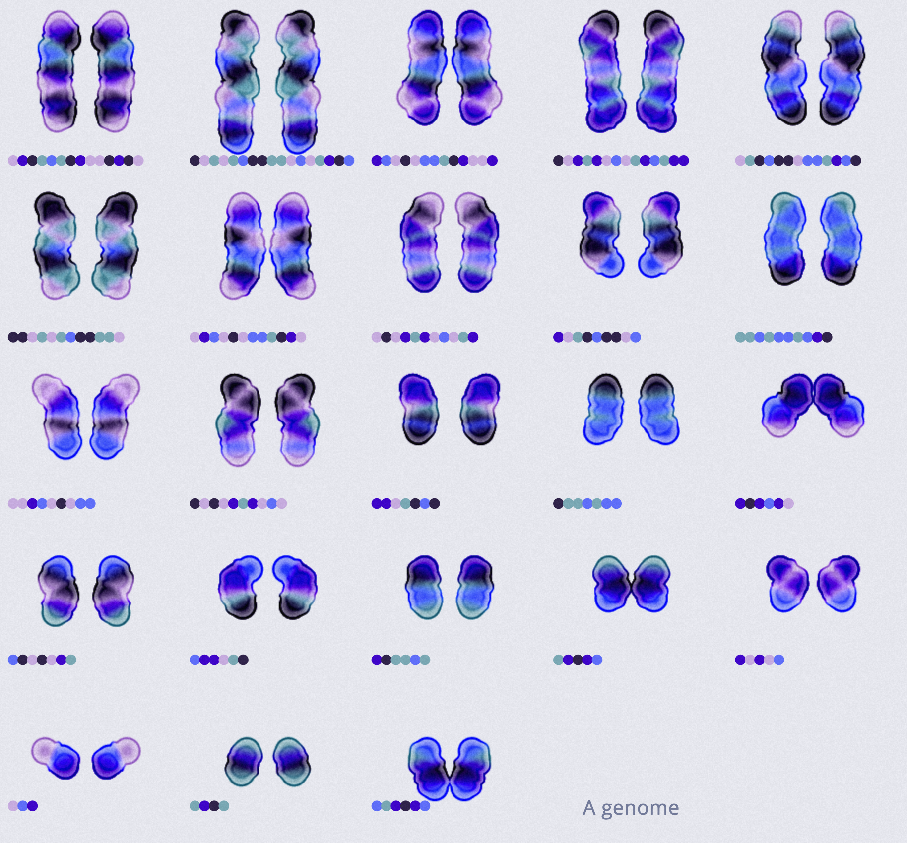
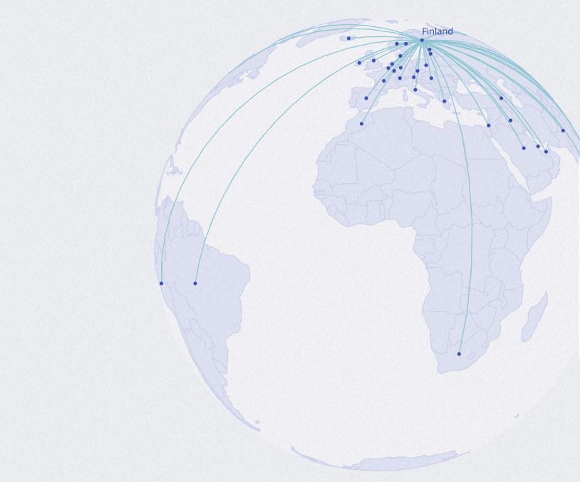
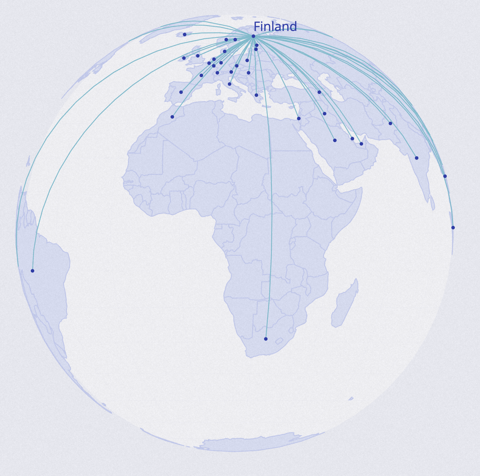
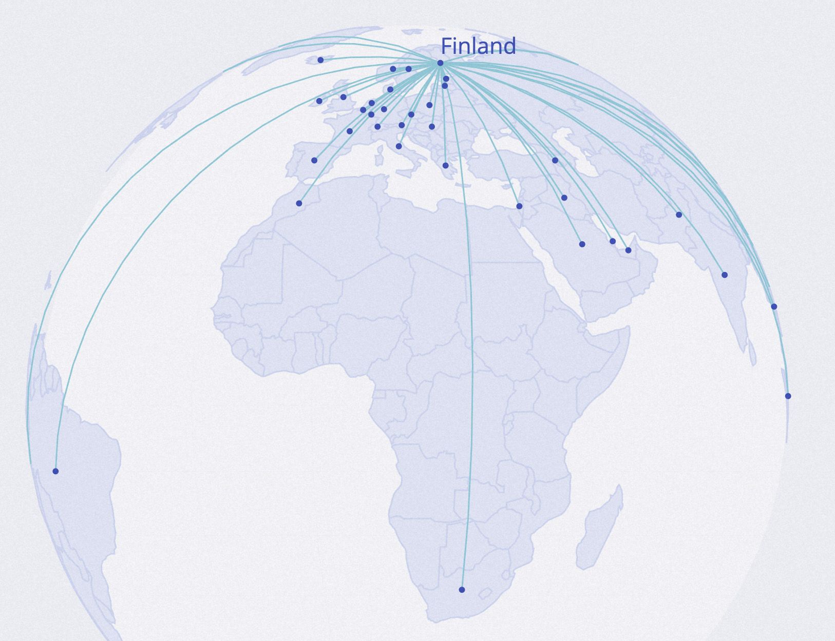
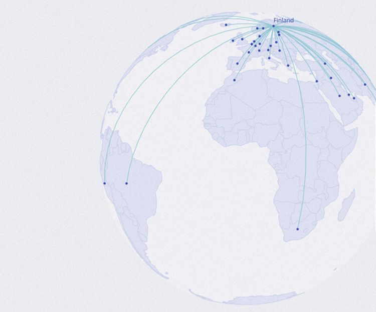
Data visualisation helps to analyse research results: The case of FINNGEN
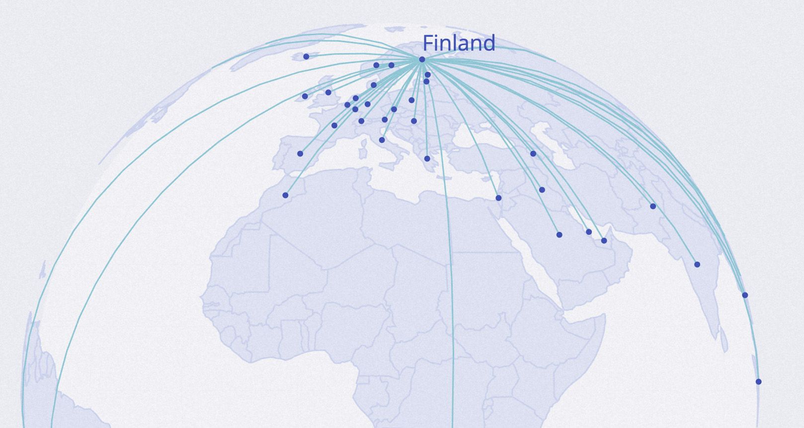
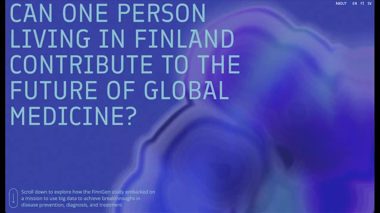
The internationally unique FinnGen research project aims to collect genetic samples from all over Finland. The main objective of the project is to increase our understanding of the causes of diseases and to contribute to their diagnosis, prevention and development of treatments.
The study will use samples collected by Finnish biobanks and aims to involve 500,000 Finns, representing about 10% of the population. There are only a few research projects of similar scale in the world and a large number of Finnish universities, health institutions and biobanks are participating in this major research project.
‘The study has already identified hundreds of hereditary risk and protective factors for many common and complex diseases that are typical of the Finnish population. Examples include genetic variants that increase the risk of certain eye and hearing diseases, cancers and infertility, and genetic variants that protect against heart disease and glaucoma. Genetics can provide important new insights into the biological mechanisms of disease and can also be used to develop new treatments’, said Mari Kaunisto, FinnGen's Director of Communications.
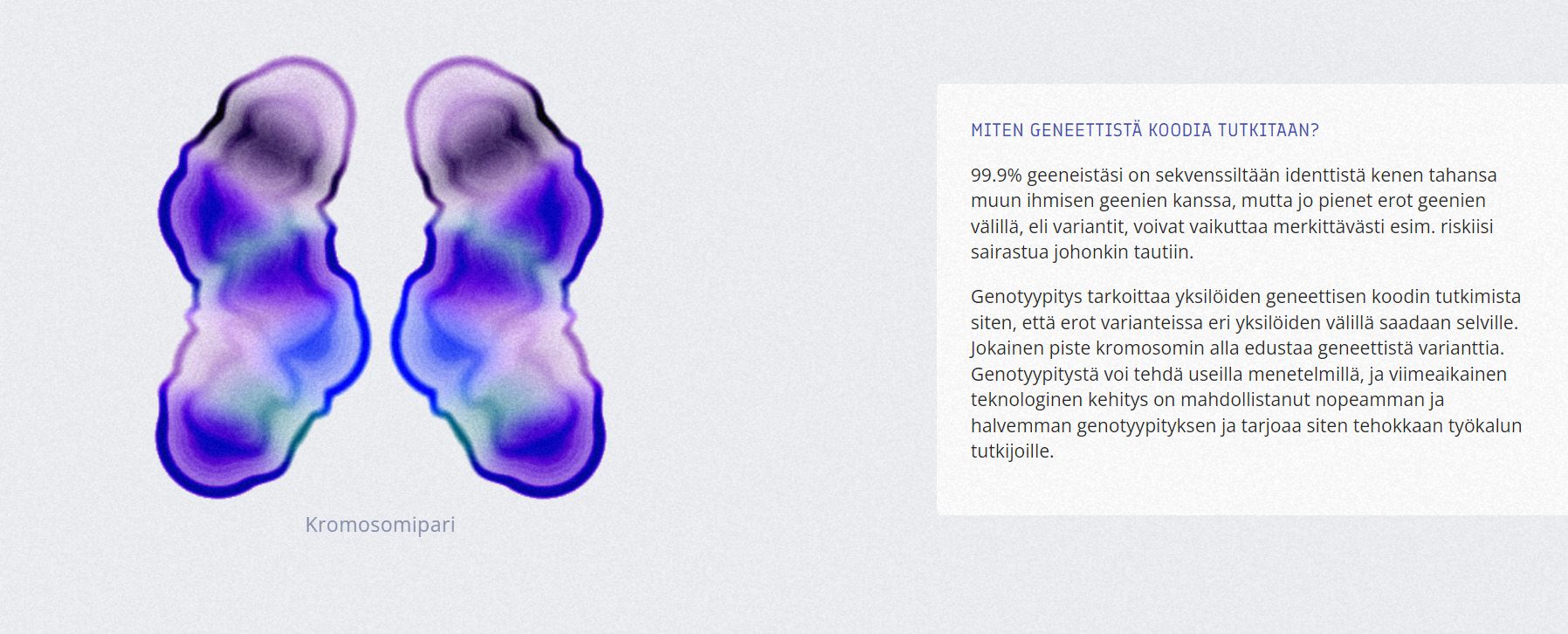
The research group of the Department of Art and Media at the School of Arts, Design and Architecture is participating in the information design and interactive data visualisations of the project.
'Our goal was to create an interactive visualisation that would not only help scientific research to discover new insights from the visualisation tools we have developed, but also to design outcome of the research more understandable and accessible to Finnish citizens who have contributed to genetic research’, says Professor Rupesh Vyas, leader of the Aalto project team.
The other members of the team are Information Design researchers Nicola Cerioli and Federico Simeoni, Visual Communications Design students Adelaida Avila, Anastasiia Balagurova and Ulla Eronen and New Media student Margo Nowicka.
As the FinnGen study involves a large number of Finns, communicating the research and its results is particularly important. However, genetic research and health registries, as well as the huge amount of data in FinnGen, are challenging issues to communicate in words.
‘Data visualisation collaborations have proven to be a meaningful and inspiring way to package complex information in the most understandable form’, says Mari Kaunisto.
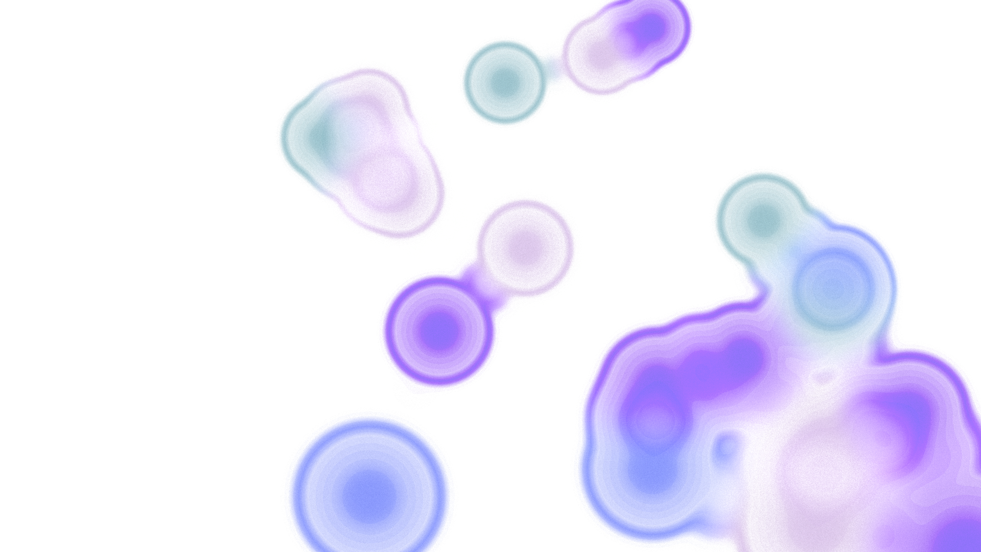
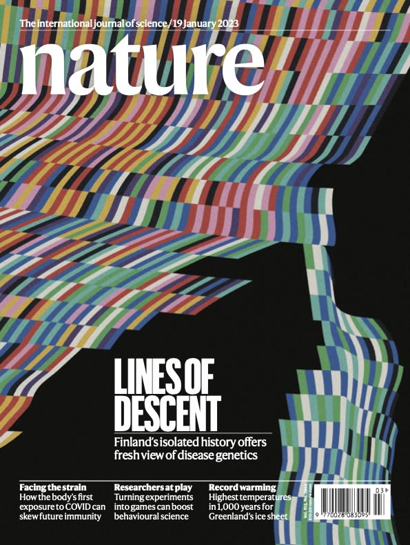
The results of the FinnGen research project were published in January 2023 in the leading scientific journal Nature. The cover visualisation was created by Federico Simeoni, Małgorzata Nowicka, Nicola Cerioli and Rupesh Vyas.


Want to know more about information design?
Follow the biennial Visualizing Knowledge seminar! The theme in 2023 was 'uncertainty' and how visualizing knowledge can help us to structure the world, understand change and see our role in it.
16.6.2023 VK23 | Visualizing Uncertainty (aalto.fi)
References:
Data visualization handbook; Koponen, Hildén, 2016, Aalto ARTS Books
Visualizing Knowledge 2023 seminar website